I visited a pretty cool company this morning and the person who gave me the tour showed me their architecture diagram. It was made of sticky notes! I was surprised because it’s only the 2nd time I’ve seen any organization, regardless of size, do something like this.
The first, of course, is when I did this with a big data company a couple of years ago. There you have it, two pieces of data that says you need to stop using Visio, and other tools no one looks at, to make sense of your architecture.
Here’s what we did:
 First, we dedicated a room in this client’s office to visualize all of their technical capability, from what tools they use and how their systems work. This room was used anytime there was a problem they needed to figure out. The people who needed to solve the problem simply met in front of this wall so they could figure out where the actual problem was. They felt it was much more effective than sitting around a PPT, that was probably outdated, and discussing what the problem might be.
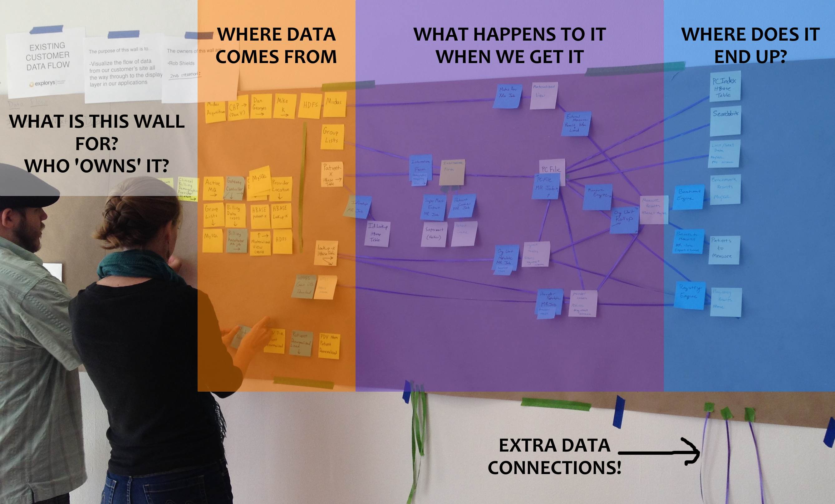
When the system changed, this visualization changed. We knew what external systems were providing data, interconnections between all our applications and what screens the data ended up on. Need traceability? Take a damn picture of it.
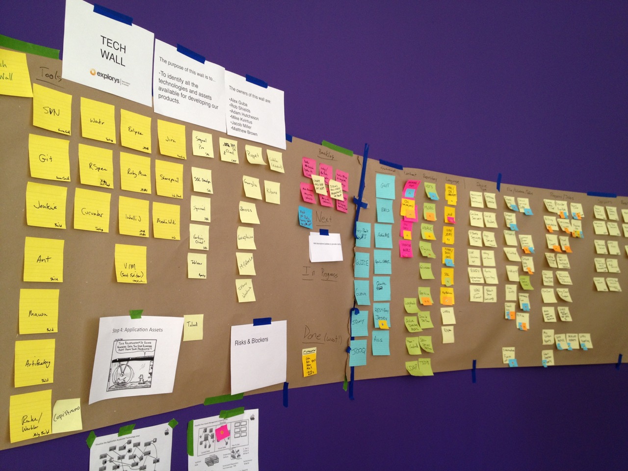
Below is the ‘tech wall’ which visualized all the tools we used such as requirements management, code management, utilities and more. This is fantastic way to see how much information management debt you have. These guys were using SVN and GIT with multiple sites and had to synchronize two code repos in 3 different physical locations because the migration from SVN to GIT was an ongoing project that had no end in sight.
It was also easy to see why there wasn’t alignment around what was being worked on because there was no single source of truth, meaning each functional group had their own truth of what was in the pipeline, what was being worked on and what was planned for the release.
As a bonus, we also visualized the entire history of this organization on the wall that everyone would see when they walked into their office:
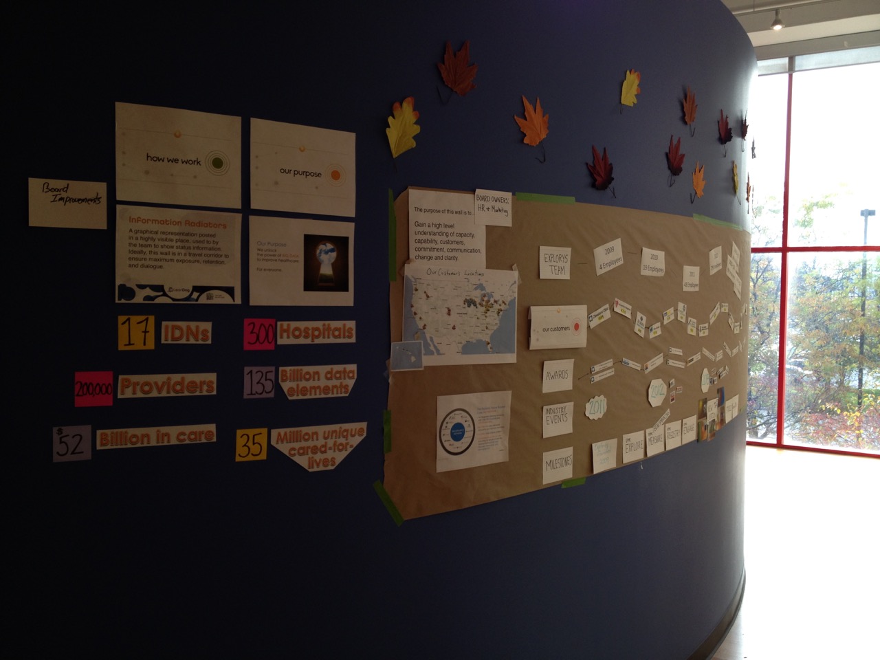
We showed growth over time:
- customer acquisition
- employee count
- product releases
- current state of the business (purpose, mission, clients etc)
- major industry awards
In a physical products company, you can see what they make. In software, it’s in our brains so there’s nothing better than scooping out all the delicious nuggets from your brains and posting them on a wall. It’s the quickest, and most effective way to communicate, and it’s brain-dead easy to do and modify.