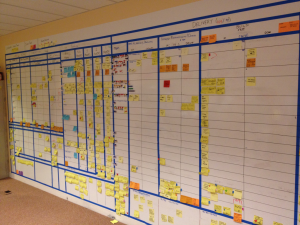
Our EKB (Enterprise Kanban Board) has gone through 5 major revisions over the last year. We started our using a traditional Kanban board to measure flow and on-boarded all work across all departments.
Originally we were tracking projects only and then expanded into tracking MMFs (minimal marketable features) with the goal of figure out our capacity and throughput.
We wanted to get to a state where teams would be able to establish a monthly throughput and them long-term plan accordingly. What was actually happening was that teams were shoving features into the schedule based on due dates. So if their throughput was actually 4 features per month but they needed 38 to meet the schedule, they’d cram 38 in “1 month away”.
Over the year it’s been re-built 4 times and tweaked often. At one point we purposely let it die because no one was getting any value out of it or using it. One day one of the managers thought it would be great if we could visualize all the releases that were coming up and voila! EKB was re-born and back like a bad rash!
Ok, that’s enough context…once we moved to a new model for delivering work which is now focused on lines of business (not really a product focus, but close to it), we needed a different way to visualize the work.
Duh, Ask the Customer!
What a crazy idea…we started by asking people in the organization what they need and want to see. We asked the PMO, directors, stakeholders and the leads on a huge program we’re starting on.
They all wanted a higher-level roll-up of information for these purposes:
- raise issues, risks and dependancies sooner
- remove the need for weekly status reports
- a snapshot of various portfolios
- overall health with a bunch of parameters
The first thing we did was mockup a new version:
We posted the mockup, including a video walk-through on our Yammer site and sent it to all the people who would need to review it. Given our early feedback, we knew we were on the right path.
In parallel to that, we identified our core customers:
- IT Stakeholders and Chiefs
- Business Stakeholders and Chiefs
- PMO
- IT Directors and Managers
- IT Staff – Application Services
- IT Staff – PMs
- IT Staff – Other
We sent these cohorts a short survey and asked them to answer this question:
- When I look at the EKB, I want to see…
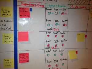
We looked at the results and validated our assumptions, given our initial feedback, and the end result was finished:
Instead of measuring flow, the columns on our board are:
- New Requests: brand new stuff no one has looked at yet.
- Intake:
- In Progress: IT Planning group is doing its thing
- Submitted for Funding
- Funded, Not Committed
- Service Queue: work has been accepted by service owner
- Health/Risks: this shows the health of the service group around scope, schedule, budget, “quality” and other factors.
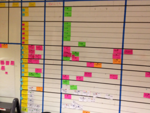
- In Delivery: 0% to 100% as measured by features delivered in business acceptance testing. This is like a visual horse race so you can quickly see progress
- Transition: handed off to business
- Done
After talking to consumers of the data and the survey, we found out most people wanted higher-level information for this board and we realized we could satisfy the vast majority of consumers with a portfolio level board. We still use project Kanban boards for all the gory details but this view now answers more important questions:
- what projects don’t have money?
- what projects have money but aren’t committed?
- what projects have been committed?
- what’s the overall status on delivery?
- how healthy is the service group?
- what risks and issues need to be talked about?
This new portfolio level board is going to remove the need for weekly status reports and we’re encouraging people from the business to come down and look at it weekly instead of relying on other status reports. We see this new version as a conversation provoker because the data is more relavent to the audience.


